Correlation is the measure of how two or more variables are related to one another, also referred to as linear dependence. An increase in demand for a product increases its price, also called the demand curve, traffic on roads at certain intervals of time of the day, the amount of rain correlates with grass fires, the examples are many.
Causation
Correlation doesn’t imply causation, even though the two variables have a linear dependence, one should not assume that one is affecting the other without proper hypothesis testing. Correlation will give you an exploratory overview of any dependence between variables in your dataset, their causation can only be understood after careful study. For example, women who are more educated tend to have lesser children. Women who are less educated tend to have more children, it’s a general observation. If you look at the population of developed and under-developed countries and look at their national education index, the two seem to be correlated but we can’t say education makes you produce lesser babies. So, correlation is best used as a suggestion rather than a technique that gives definitive answers. It is often a preparatory piece of analysis that gives some clues to what the data might yield, to be followed with other techniques like regression.
Positive and Negative Correlation
Positive Correlation
Two variables X and Y are positively correlated if high values of X go with high values of Y and low values of X go with lower values of Y. For Example:
- Height and Weight – Taller people are generally heavier. But many shorter ones are heavy (Correlation doesn’t imply Causation). The cause of this behavior cannot be associated with height alone.

Negative Correlation
Two variables are said to be negatively correlated if a high value of X goes with low values of Y and vice versa. For Example:
- More educated women tend to have lesser children. This doesn’t mean that more education causes women to have lesser children, it’s usually caused by many factors which may not be the same in different countries. There are many socio-economic factors that show a strong positive correlation between more education and fertility [4] [5] [6], one article will not be enough to cover the entire scope of this research.

No Correlation
When X and Y have no relation, i.e a change in one variable doesn’t affect the other variable.
Identifying Correlation
One of the ways to identify correlation is to look for visual cues in scatter plots. An increasing trend line indicates a positive correlation, while a decreasing trend line may indicate a negative correlation.

While the above method may work as a preliminary analysis but to get a concrete measure, we use something called a correlation coefficient to get the exact degree of correlation.
Pearson’s Correlation coefficient
It gives an estimate of the correlation between two variables. For continuous variables, we usually use Pearson’s correlation coefficient. It is the covariance of the two variables divided by the product of their standard deviations. The value range from -1 (perfect negative correlation) to +1 (perfect positive correlation); 0 indicates no correlation.
Given a pair of random variables \((X,Y) \), the formula for Pearson Correlation Coefficient denoted by \(ρ \) is:
\(𝜌 = \frac{cov(X,Y)}{σ(X)σ(Y)} \)
where:
\(cov \) is covariance
\(σ(X) \) is the standard deviation of X
\(σ(Y) \) is the standard deviation of Y
The formula for covariance is:
\(cov(X,Y) = \sum_{i=1}^{n}(x_{i} – \overline{x})(y_{i} – \overline{y}) \)
Standard deviation is given by
\(\rho(X) = \sqrt{\sum_{i=1}^{n}(x_{i} – \overline{x})^2} \)
\(\rho(Y) = \sqrt{\sum_{i=1}^{n}(y_{i} – \overline{y})^2} \)
which gives us the pearson correlation coefficient as:
\(\rho(X,Y) = \frac{\sum_{i=1}^{n}(x_{i} – \overline{x})(y_{i} – \overline{y})}{\sqrt{\sum_{i=1}^{n}(x_{i} – \overline{x})^2}\sqrt{\sum_{i=1}^{n}(y_{i} – \overline{y})^2}} \)
where,
n is the sample size. The formula can be rearranged in a more simplified format by simplifying the mean:
\(\rho(X,Y) = \frac{n\sum xy – \sum x\sum y}{\sqrt{n\sum x^2 – (\sum x)^2} \sqrt{n\sum y^2 – (\sum y)^2} } \)
The value of the coefficient of correlation ρ always ranges from -1 to +1. The correlation coefficient describes not only the magnitude of correlation but also its direction. +0.8 indicates that correlation is positive because the sign of ρ is plus and the degree of correlation is high because the numerical value of ρ=0.8 is close to 1. If ρ=-0.4, it indicates that there is a low degree of negative correlation because the sigh of ρ is negative and the numerical value of ρ is less than 0.5
Note:
The correlation coefficient is sensitive to outliers as you might have guessed already because of the use of mean in the formula. So, in exploratory data analysis, it is important to remove any outliers from the dataset before finding the correlation.
Let’s try to find correlation coefficient on a sample dataset. A classic example is the correlation between the student’s GPA and their attendance in classroom. Looking at the scatter plot trendline we can assume there is a positive correlation here, so let’s try and find out the magnitude of correlation.

The dataset contains Attendance and GPA of 75 students in a class with the number of school equal to 180. The full dataset is given below.
| GPA (X) | Days Present (Y) | \(X^2 \) | \(Y^2 \) | \(XY \) |
|---|---|---|---|---|
| 4 | 180 | 16 | 32400 | 720 |
| 2.5 | 150 | 6.25 | 22500 | 375 |
| 4 | 170 | 16 | 28900 | 680 |
| 3.9 | 180 | 15.21 | 32400 | 702 |
| 3.75 | 177 | 14.0625 | 31329 | 663.75 |
| 3.8 | 180 | 14.44 | 32400 | 684 |
| 2.9 | 140 | 8.41 | 19600 | 406 |
| 3.1 | 169 | 9.61 | 28561 | 523.9 |
| 3.25 | 168 | 10.5625 | 28224 | 546 |
| 3.4 | 152 | 11.56 | 23104 | 516.8 |
| 3.3 | 150 | 10.89 | 22500 | 495 |
| 3.9 | 170 | 15.21 | 28900 | 663 |
| 1.35 | 109 | 1.8225 | 11881 | 147.15 |
| 4 | 180 | 16 | 32400 | 720 |
| 1 | 108 | 1 | 11664 | 108 |
| 3.85 | 175 | 14.8225 | 30625 | 673.75 |
| 2.98 | 144 | 8.8804 | 20736 | 429.12 |
| 2.75 | 120 | 7.5625 | 14400 | 330 |
| 2.75 | 133 | 7.5625 | 17689 | 365.75 |
| 3.6 | 160 | 12.96 | 25600 | 576 |
| 3.5 | 160 | 12.25 | 25600 | 560 |
| 3.5 | 159 | 12.25 | 25281 | 556.5 |
| 3.5 | 165 | 12.25 | 27225 | 577.5 |
| 3.85 | 180 | 14.8225 | 32400 | 693 |
| 2.95 | 149 | 8.7025 | 22201 | 439.55 |
| 3.95 | 180 | 15.6025 | 32400 | 711 |
| 3.65 | 160 | 13.3225 | 25600 | 584 |
| 3.55 | 155 | 12.6025 | 24025 | 550.25 |
| 3.58 | 156 | 12.8164 | 24336 | 558.48 |
| 2.98 | 145 | 8.8804 | 21025 | 432.1 |
| 1.5 | 122 | 2.25 | 14884 | 183 |
| 1.75 | 131 | 3.0625 | 17161 | 229.25 |
| 2.2 | 156 | 4.84 | 24336 | 343.2 |
| 3 | 166 | 9 | 27556 | 498 |
| 3 | 170 | 9 | 28900 | 510 |
| 3 | 155 | 9 | 24025 | 465 |
| 3.15 | 158 | 9.9225 | 24964 | 497.7 |
| 3.9 | 170 | 15.21 | 28900 | 663 |
| 3.15 | 160 | 9.9225 | 25600 | 504 |
| 3.85 | 165 | 14.8225 | 27225 | 635.25 |
| 2.7 | 159 | 7.29 | 25281 | 429.3 |
| 1 | 119 | 1 | 14161 | 119 |
| 3.25 | 168 | 10.5625 | 28224 | 546 |
| 3.9 | 175 | 15.21 | 30625 | 682.5 |
| 2.8 | 161 | 7.84 | 25921 | 450.8 |
| 3.5 | 160 | 12.25 | 25600 | 560 |
| 3.4 | 160 | 11.56 | 25600 | 544 |
| 2.3 | 150 | 5.29 | 22500 | 345 |
| 2.5 | 140 | 6.25 | 19600 | 350 |
| 2.35 | 148 | 5.5225 | 21904 | 347.8 |
| 2.95 | 149 | 8.7025 | 22201 | 439.55 |
| 3.55 | 160 | 12.6025 | 25600 | 568 |
| 3.6 | 155 | 12.96 | 24025 | 558 |
| 3.3 | 166 | 10.89 | 27556 | 547.8 |
| 3.85 | 160 | 14.8225 | 25600 | 616 |
| 3.95 | 179 | 15.6025 | 32041 | 707.05 |
| 2.95 | 145 | 8.7025 | 21025 | 427.75 |
| 2 | 143 | 4 | 20449 | 286 |
| 2 | 145 | 4 | 21025 | 290 |
| 1.75 | 140 | 3.0625 | 19600 | 245 |
| 1.5 | 122 | 2.25 | 14884 | 183 |
| 1.5 | 125 | 2.25 | 15625 | 187.5 |
| 1 | 110 | 1 | 12100 | 110 |
| 1.95 | 120 | 3.8025 | 14400 | 234 |
| 1.8 | 165 | 3.24 | 27225 | 297 |
| 2 | 120 | 4 | 14400 | 240 |
| 3.25 | 171 | 10.5625 | 29241 | 555.75 |
| 3.9 | 160 | 15.21 | 25600 | 624 |
| 2.15 | 144 | 4.6225 | 20736 | 309.6 |
| 2.5 | 150 | 6.25 | 22500 | 375 |
| 1.95 | 149 | 3.8025 | 22201 | 290.55 |
| 1 | 120 | 1 | 14400 | 120 |
| 3.95 | 150 | 15.6025 | 22500 | 592.5 |
| 2.75 | 149 | 7.5625 | 22201 | 409.75 |
| 3.5 | 155 | 12.25 | 24025 | 542.5 |
| \(\sum X = \) 219.89 | \(\sum Y = \)11469.0 | \(\sum X^2 = \) 700.8697 | \(\sum Y^2 = \)1780033.0 | \(\sum XY = \)34646.7 |
Substituting the above values in our correlation coefficient formula:
\(\rho(X,Y) = \frac{n\sum XY – \sum X\sum Y}{\sqrt{n\sum X^2 – (\sum X)^2} \sqrt{n\sum Y^2 – (\sum Y)^2} } \)
we get:
\(\rho(X,Y) = \frac{75 \times 700.8697 – 219.89 \times 34646.7}{\sqrt{75 \times 700.8697 – 219.89^2} \sqrt{75 \times 1780033.0 – 11469^2} } = 0.84 \)
Indicating a POSITIVE correlation.
Correlation using python
There are many standard python libraries which can be used to calculate correlation, I will use the well known numpy library. Below code shows the calculations for the above dataset using formula as well numpy.
import numpy as np
import math
import seaborn as sn
import matplotlib.pyplot as plt

# setting seaborn as default chart
sn.set()

# dataset
gpa_days = np.array([[4,180],[2.5,150],[4,170],[3.9,180],[3.75,177],[3.8,180],[2.9,140],[3.1,169],[3.25,168],[3.4,152],[3.3,150],[3.9,170],[1.35,109],[4,180],[1,108],[3.85,175],[2.98,144],[2.75,120],[2.75,133],[3.6,160],[3.5,160],[3.5,159],[3.5,165],[3.85,180],[2.95,149],[3.95,180],[3.65,160],[3.55,155],[3.58,156],[2.98,145],[1.5,122],[1.75,131],[2.2,156],[3,166],[3,170],[3,155],[3.15,158],[3.9,170],[3.15,160],[3.85,165],[2.7,159],[1,119],[3.25,168],[3.9,175],[2.8,161],[3.5,160],[3.4,160],[2.3,150],[2.5,140],[2.35,148],[2.95,149],[3.55,160],[3.6,155],[3.3,166],[3.85,160],[3.95,179],[2.95,145],[2,143],[2,145],[1.75,140],[1.5,122],[1.5,125],[1,110],[1.95,120],[1.8,165],[2,120],[3.25,171],[3.9,160],[2.15,144],[2.5,150],[1.95,149],[1,120],[3.95,150],[2.75,149],[3.5,155]])

## finding correlation using pearson correlatoin formula
total = len(gpa_days)
sum_x = np.sum(gpa_days[:,0])
sum_y = np.sum(gpa_days[:,1])
sum_xx = np.sum(gpa_days[:,0]**2)
sum_yy = np.sum(gpa_days[:,1]**2)
sum_xy = np.sum(gpa_days[:,1]*gpa_days[:,0])

correlation_p = (total*sum_xy - sum_x*sum_y)/(math.sqrt(total*sum_xx - sum_x**2) * math.sqrt(total*sum_yy - sum_y**2))

print("correlation using formula:",correlation_p)

xy = [gpa_days[:,0],gpa_days[:,1]]

# correlation using the numpy standard library
# which internally uses pearsons correlation
correlation_matrix = np.corrcoef(xy)
print("correlation using numpy:",correlation_matrix[0][1])


fig, ax = plt.subplots(ncols=2, figsize=(15,5))


sn.heatmap(np.corrcoef(xy), color="k", annot=True, ax=ax[1])
ax[1].set_title("correlation matrix")

sn.scatterplot(gpa_days[:,0], gpa_days[:,1], ax=ax[0], x="GPA", y="Numbers of days attended (days)")
ax[0].set_title("Attendance vs GPA dataset")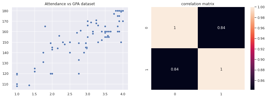
Correlation Matrix
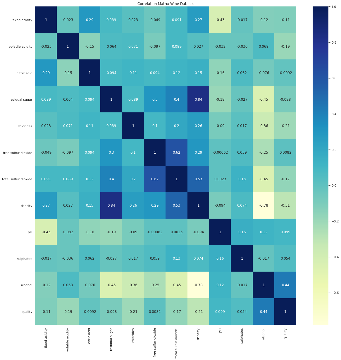
When there are more than 2 variables and you want to understand how correlated all the variables are, we use a correlation matrix that gives us a single view of all correlations. A correlation matrix is nothing but a table showing correlation coefficients among your variables. Each cell in the table shows the correlation between two variables.

The below matrix shows the correlation among different constituents of wine in our dataset.
From the correlation matrix above we can make the following observations:
- density has a strong positive correlation with residual sugar, whereas it has a strong negative correlation with alcohol.
- pH & fixed acidity has a negative correlation.
- density & fixed acidity has a positive correlation.
- citric acid & fixed acidity has a positive correlation.
- citric acid & volatile acidity has a negative correlation.
- free sulfur dioxide & total sulfur dioxide has a positive correlation.
Code for the above analysis
import pandas as pd
import seaborn as sn
import matplotlib.pyplot as plt
from sklearn.datasets import load_wine

# exploring wine dataset
df = pd.read_csv('https://archive.ics.uci.edu/ml/machine-learning-databases/wine-quality/winequality-white.csv', sep=';')
print(df.head())
plt.figure(figsize=(20,20))
plt.title("Correlation Matrix Wine Dataset")
sn.heatmap(df.corr(), color="k", annot=True, cmap="YlGnBu")
Key Ideas
- The correlation coefficient measures the extent to which two pairs of variables are related to each other.
- Scatter plots are used to get a visual understanding of correlation.
- Correlation Matrix can be used to get a snapshot of the relationship between more than two variables in a tabular format.
- The correlation coefficient is a standardized metric that ranges from -1 and +1. +ve values indicate a positive correlation. -ve values indicate a negative correlation. 0 indicates no correlation.
Data Sources:
[1] Height and Weight datasource -http://www.math.utah.edu/~korevaar/2270fall09/project2/htwts09.pdf
[2] Wine Dataset – https://archive.ics.uci.edu/ml/datasets/wine
References:
[1] A Simple Study on Weight and Height of Students https://www.hindawi.com/journals/tswj/2017/7258607/
[2] https://blogs.worldbank.org/health/female-education-and-childbearing-closer-look-data
[3] https://wol.iza.org/uploads/articles/228/pdfs/female-education-and-its-impact-on-fertility.pdf
[4] Becker, G S and G H Lewis (1973), “On the interaction between the quantity and quality of children”, Journal of Political Economy 81: S279–S288.
[5] Galor, O and D N Weil (1996), “The gender gap, fertility, and growth”, American Economic Review86(3): 374–387.
[6] Galor, O and D N Weil (2000), “Population, technology, and growth: From Malthusian stagnation to the demographic transition and beyond”, American Economic Review 90(4): 806–828.
[7] https://en.wikipedia.org/wiki/Pearson_correlation_coefficient