Previously I wrote an article explaining the underlying maths behind polynomial regression. In this post I will use Python libraries to regress a simple dataset to see polynomial regression in action. If you want to fully understand the internals I recommend you read my previous post.
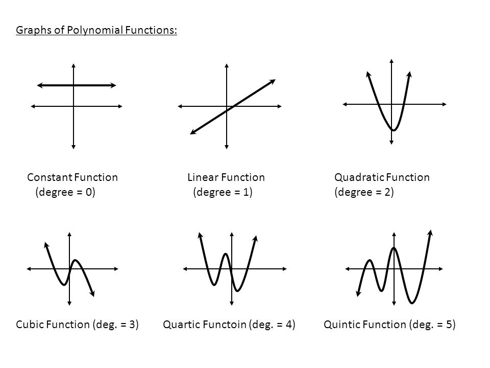
Polynomial regression is a method of finding an nth degree polynomial function which is the closest approximation of our data points. Simply put, If my simple line doesn’t fit my data set, I will go on and try to find a quadratic, a cubic or a much higher degree function which might fit. How to find which degree to use is a decision which depends completely on the data at hand. A quick glance at a simple scatter plot can reveal a lot about the curvilinear relationship between the data points. Take a look at the below graphs of different degrees of polynomial, this is important because this is what we are trying to fit our data point into.
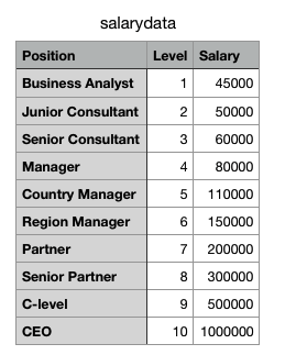
Lets try an example now. In any organization, as we go up the ladder our salary also grows with it, the catch is that the growth is not exactly linear. A CEOs salary is many times higher compared to an entry level engineer or even a mid level manager, so a simple linear regression won’t help us predict the salary of a CEO if we know the salaries of few people above us in the hierarchy. I found a simple Salary dataset as shown below for my analysis which I will run through different degrees of polynomial regression:
Python Code:
import matplotlib.pyplot as plt
import numpy as np
from sklearn.linear_model import Ridge
from sklearn.preprocessing import PolynomialFeatures
from sklearn.pipeline import make_pipeline

y_train = [[45000],[50000],[60000],[80000],[110000],[150000],[200000],[300000],[500000],[1000000]]
x_plot = np.linspace(0,len(y_train), len(y_train))#returns evenly spaced numbers array between start=0, stop=28, number needed=26
plt.scatter(x_plot, y_train, color='navy', s=30, marker='o', label="training points")
colors = ['teal', 'yellowgreen', 'gold', 'red','green','violet','grey']
x_plot = x_plot.reshape(-1,1)

for count, degree in enumerate([1, 2, 3]):
  model = make_pipeline(PolynomialFeatures(degree), Ridge())
  model.fit(x_plot, y_train)
  y_plot = model.predict(x_plot)
  plt.plot(x_plot, y_plot, color=colors[count], linewidth=2,
           label="degree %d" % degree)

plt.legend(loc='lower right')
plt.show()
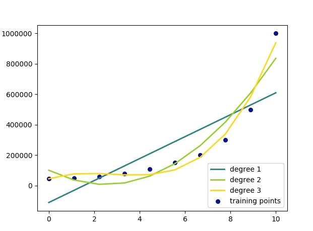
The above code gives a graph which shows our regression lines for each degrees compared with each other.
Though my 3rd-degree polynomial is a much better fit for my dataset, I know that a quadratic function (degree 2) is the most logical choice because at no point will the salary start coming down as we level up, which is a case with a polynomial of degree 3 or more.


