Third party libraries like d3js, highcharts, flotcharts, morris, raphael are all amazing no doubt but sometimes you just need something dead simple and minimal without too much fanciness. And if all you want is just a bar chart to show some data without having to include a library with a dozen charts then you better figure out something on your own. To help you get started I made a small sample of a bar chart using only HTML, CSS and Javascript. The final chart looks like this
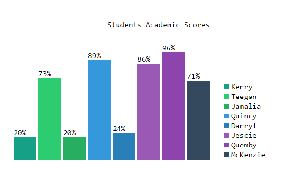
Some notes about the chart to keep its design minimal
- There are no x-axis or y-axis lines. I intentionally removed them as they don’t really add much value to the chart. The data values are already available for the user above the bars and x-axis does nothing more than being a line with a tick, so I removed them both.
- There are no labels for the bars on the x-axis like we see in most bar charts. The problem with the labels in x-axis is that they are usually too long in real world use cases, and end up overlapping the next label. The hack we usually use is to rotate them so they don’t overlap but they end up making them look ugly and also take up extra space below. A better design is to just let the legend take care of it and not show any x-axis labels at all.
Making a bar chart is the simplest of all and doesn’t need expert level knowledge of CSS, HTML or Javascript. The full source code is here:
HTML:
<div id="chart"></div>
CSS: Contains colors taken from flatuicolors.
html,
body {
  font-family: Consolas, monaco, monospace;
}

#chart {
  padding: 20px;
}

table {
  width: 100%;
  height: 400px;
}

.charttitle {
  text-align: center;
}

.bars td {
  vertical-align: bottom;
}

.bars div:hover {
  opacity: 0.6;
}

.legend {
  vertical-align: bottom;
  padding-left: 20px;
  text-align: left;
}

.legbox {
  display: block;
  clear: both;
}

.xaxisname {
  margin: 5px;
  color: #fff;
  font-size: 77%;
  padding: 5px;
  float: left;
}


/*Flat UI colors*/

.one {
  background: #16A085;
}

.two {
  background: #2ECC71;
}

.three {
  background: #27AE60;
}

.four {
  background: #3498DB;
}

.five {
  background: #2980B9;
}

.six {
  background: #9B59B6;
}

.seven {
  background: #8E44AD;
}

.eight {
  background: #34495E;
}

.nine {
  background: #2C3E50;
}

.ten {
  background: #22313f;
}

.eleven {
  background: #F1C40F;
}

.twelve {
  background: #F39C12;
}

.thirteen {
  background: #E67E22;
}

.fourteen {
  background: #D35400;
}

.fifteen {
  background: #E74C3C;
}

.sixteen {
  background: #C0392B;
}

.seventeen {
  background: #ECF0F1;
}

.seventeen.clouds {
  color: #BDC3C7;
}

.eighteen {
  background: #BDC3C7;
}

.nineteen {
  background: #95A5A6;
}

.twenty {
  background: #7F8C8D;
}
Javascript: With sample data
//chart data
var chartjson = {
  "title": "Students Academic Scores",
  "data": [{
    "name": "Kerry",
    "score": 20
  }, {
    "name": "Teegan",
    "score": 73
  }, {
    "name": "Jamalia",
    "score": 20
  }, {
    "name": "Quincy",
    "score": 89
  }, {
    "name": "Darryl",
    "score": 24
  }, {
    "name": "Jescie",
    "score": 86
  }, {
    "name": "Quemby",
    "score": 96
  }, {
    "name": "McKenzie",
    "score": 71
  }],
  "xtitle": "Secured Marks",
  "ytitle": "Marks",
  "ymax": 100,
  "ykey": 'score',
  "xkey": "name",
  "prefix": "%"
}

//chart colors
var colors = ['one', 'two', 'three', 'four', 'five', 'six', 'seven', 'eight', 'nine', 'ten', 'eleven', 'twelve', 'thirteen','fourteen'];

//constants
var TROW = 'tr',
  TDATA = 'td';

var chart = document.createElement('div');
//create the chart canvas
var barchart = document.createElement('table');
//create the title row
var titlerow = document.createElement(TROW);
//create the title data
var titledata = document.createElement(TDATA);
//make the colspan to number of records
titledata.setAttribute('colspan', chartjson.data.length+1);
titledata.setAttribute('class', 'charttitle');
titledata.innerText = chartjson.title;
titlerow.appendChild(titledata);
barchart.appendChild(titlerow);
chart.appendChild(barchart);

//create the bar row
var barrow = document.createElement(TROW);

//lets add data to the chart
for (var i = 0; i < chartjson.data.length; i++) {
  barrow.setAttribute('class', 'bars');
  var prefix = chartjson.prefix || '';
  //create the bar data
  var bardata = document.createElement(TDATA);
  var bar = document.createElement('div');
  bar.setAttribute('class', colors[i]);
  bar.style.height = chartjson.data[i][chartjson.ykey] + prefix;
  bardata.innerText = chartjson.data[i][chartjson.ykey] + prefix;
  bardata.appendChild(bar);
  barrow.appendChild(bardata);
}

//create legends
var legendrow = document.createElement(TROW);
var legend = document.createElement(TDATA);
legend.setAttribute('class','legend');
legend.setAttribute('colspan', chartjson.data.length);

//add legend data
for (var i = 0; i < chartjson.data.length; i++) {
   var legbox = document.createElement('span');
   legbox.setAttribute('class','legbox');
   var barname = document.createElement('span');
   barname.setAttribute('class',colors[i] + ' xaxisname');
   var bartext = document.createElement('span');
   bartext.innerText = chartjson.data[i][chartjson.xkey];
   legbox.appendChild(barname);
   legbox.appendChild(bartext);
   legend.appendChild(legbox);
}
barrow.appendChild(legend);
barchart.appendChild(barrow);
barchart.appendChild(legendrow);
chart.appendChild(barchart);
document.getElementById('chart').innerHTML = chart.outerHTML;
You can see the preview here: http://codepen.io/Muthukrishnan/pen/vGoZVz
This code is just a proof of concept of what is possible and is not production ready. You can use this idea to build your own chart.